Using Eye Tracking to Enhance the Cooper Hewitt Museum’s Mobile Experience
A Usability Evaluation
1-minute read
OVERVIEW
Our team of 4 grad students at the Pratt DX Center partnered with the Cooper Hewitt Museum to perform an eye tracking usability study on two new areas of their website on mobile: Design Topics and Emerging Designers. Participants performed a series of in-lab tasks while browsing the website on a mobile device as we tracked their eye movements using Tobii Pro eye tracking software.
Key findings:
Clickable elements weren’t recognizable. Page headers didn’t look clickable to users. On mobile, they were missing the mouse hover that signifies something is clickable, making this a more notable issue for mobile users. Bright orange hyperlinks were used (inconsistently) to signify a link out to a new page, but those didn’t always stand out as CTAs either. And too many of these bright hyperlinks throughout body text distracted users as they tried to scan the page for information.
Mobile isn’t being optimized. Pages were too long on mobile, causing users to get stuck in what felt like an infinite scroll. And important CTAs were hidden at the bottom of pages on mobile devices beneath long scrolls making them difficult to find.
People were confused by what ‘Design Topics’ were. Pages and articles within this area of the site didn’t seem to fit into users mental models of what a ‘Design Topic’ is. Users felt that that some of the categories that were too narrow in scope didn’t belong here.
Our team delivered a research readout presentation that covered these key findings, as well as provided recommendations and design solution mockups to address these findings.
7-minute read
BACKGROUND
How do these web pages grab users’ visual attention while browsing content on mobile?
Cooper Hewitt is the only museum in the U.S. that is devoted exclusively to historical and contemporary design. Their website serves as an extension of their physical museum, where people can browse exhibitions, explore digital collections, and find free design resources liked design talks with influencers, design-thinking resources, and more.
Our team worked with stakeholders from the Cooper Hewitt museum to evaluate the usability of two new areas of their website on mobile:
Design Topics: Is an area of the website designed to link and aggregate data from across the site so that students or researchers can search and find resources in one place.
Emerging Designers: This page is an offshoot of the education page designed to target aspiring designers (ranging from high school students to new career professionals) by providing them with learning opportunities and other events.
Our primary goal for this research study was to understand how users view the visual design and hierarchy of these Design Topics and Emerging Designer pages while browsing content on mobile devices.
Timeline: April 2022 – May 2022
Tools: Tobii Pro eye tracking software, Figma
Team: Wuke Zhou, Yuki Shimano, Shih Wen Huang, and myself
My Role: Design research plan and study materials, moderate usability testing sessions, analyze and synthesize eye tracking data in Tobii pro.
Deliverables: Research Report
OUR PROCESS
Methods of analysis.
Moderated Usability Testing
In-person lab testing with participants as they navigated the Cooper Hewitt website to complete a series of tasks
Tobii Mobile Eye Tracking
Participants interacted with an iPhone 11 while their eye gaze was tracked through Tobii eye tracking software
Retrospective Think Aloud
Participants watched a video replay of their eye gaze and explained the thoughts and feelings they had at the time
What we tested and why.
As we started creating a research plan, we developed the following hypothesis:
People usually don't use a mobile device to perform research-oriented tasks.
Because the Design Topics pages are designed to link data for research-oriented tasks, we tried to focus our testing tasks on what we think users on mobile would be doing on these pages instead.
Therefore, we tested users on quick action tasks like coming to the Design Topics area and then purchasing a ticket to an exhibition or finding out where a documentary was screening – tasks that would be more common for mobile device users, versus reading through a lot of content for in-depth research purposes.
For the Emerging Designers pages, we focused similarly on quick action tasks like registering for a workshop and finding key information on a subject.
OUR TASKS
Design Topics
- Task 1: You’re doing research on the “Mud Frontier”. Find out where they’ve shown their film documentary.
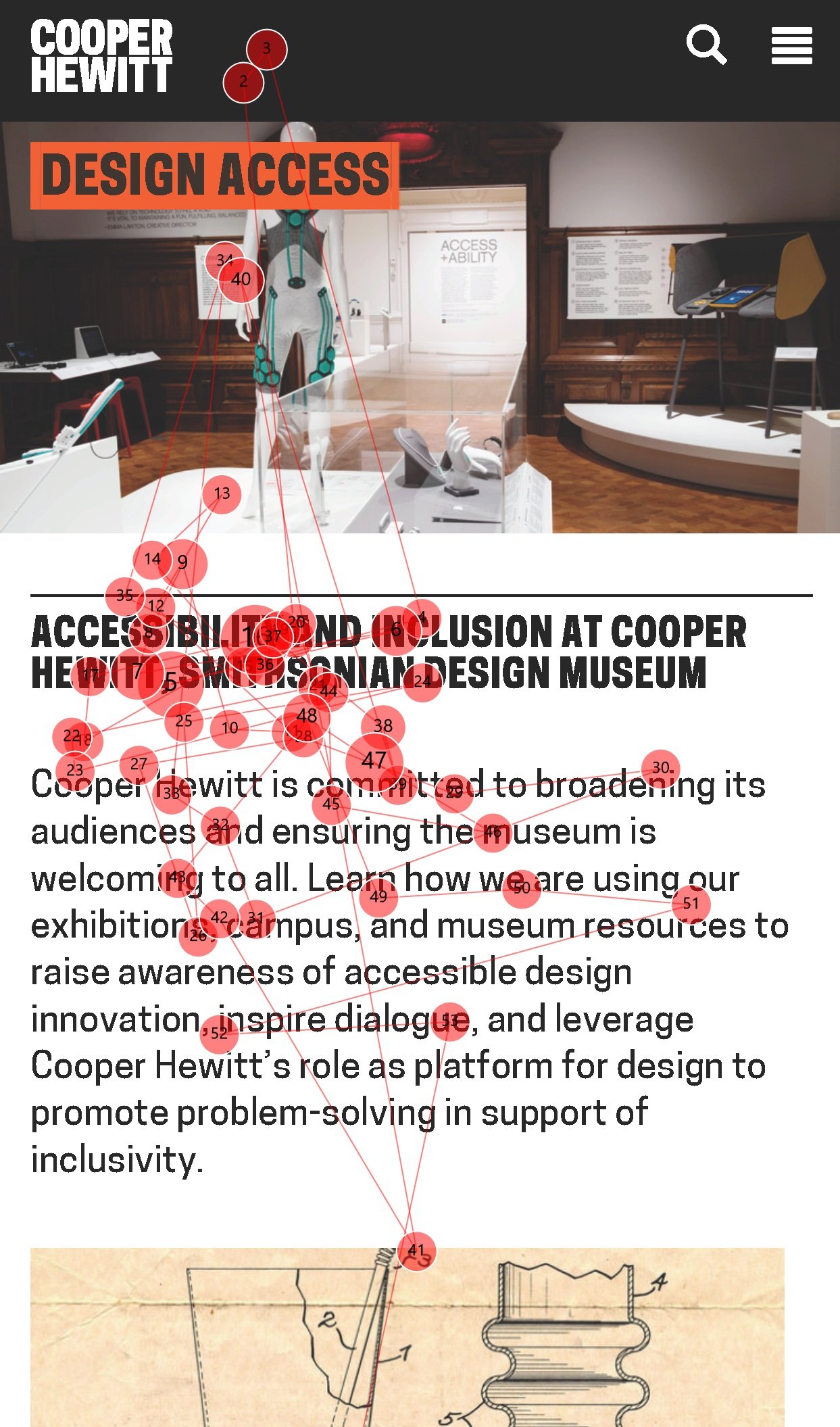
- Task 2: Navigate to the “Design Access” page. In their image description guidance, find out how they say Alt-text should be handled.
- Task 3: Head to the “Health Design” page. Purchase tickets to the design and healing exhibition.
Emerging Designers
- Task 4: Find learning opportunities at the museum for aspiring designers like you.
- Task 5: Register for their design workshop.
- Task 6: Find out who was a finalist in this years Design Competition.
Participant breakdown.
8 participants were recruited for this study, where each team member was in charge of moderating two usability testing sessions and note taking for two other testing sessions. The target audience for this study was young designers and students (who would be more likely to be visiting the Design Topics and Emerging Designers pages), so we recruited participants through Pratt’s student listserv and by snowball sampling participants through other young aspiring designers.

Overall, our participants fit the target audience we were aiming for. They were between the ages of 18-34, and almost all participants were current students, with one participant just entering into their early career profession. They were also all aspiring designers in the field.
When asked about which device they preferred to use to visit a museum website, they overwhelmingly said desktop and this was due to the fact that they felt they could see more and do more on desktop. Confirming our earlier hypothesis, they said they do use mobile devices sometimes but mostly for quicker things like purchasing tickets and registering for events.
Our guiding research questions.
Our team came together to define 3 primary research questions that helped shape and define the scope of our analysis:
1
Can users find information easily?
2
Is this experience mobile-friendly?
3
Can users make sense of information?
RESULTS
Can users find information easily?
We wanted to understand how the visual design and hierarchy of pages aided (or mislead) users from navigating the website via the tasks that we designed. Were page headers obvious? Could users find important buttons? Did the webpage follow a readable structure? These are some of the questions we asked ourselves while analyzing our results, which led us to our first finding.
Finding 1: Clickable elements weren't recognizable
Overall, we found that the site’s clickable elements were not easily recognizable to many of our participants.
“I generally feel with this whole website that they have not really highlighted what you should click on.”
1.1. Page headers don’t seem clickable
The website is structured in a very editorial way, where content blocks look like newspaper articles. While this structure may look aesthetically pleasing, it lacks significant cues that page headers are clickable, leaving participants to think there are no more actions to take aside from reading the brief page description. This problem may be more pronounced for mobile users, where they lack clickable arrow signifiers. Watch the video below to see one participant explain their confusion around what’s clickable.

1.2. Orange hyperlinks aren’t the most effective as CTA buttons
The website makes occasional use of orange hyperlinks to lead users to discover more. While these hyperlinks were highly visible to users, they didn’t necessarily stand out as ‘Call to Action’ buttons for some. These participants thought that the hyperlinks were just a highlighted piece of text, but not something to click on.
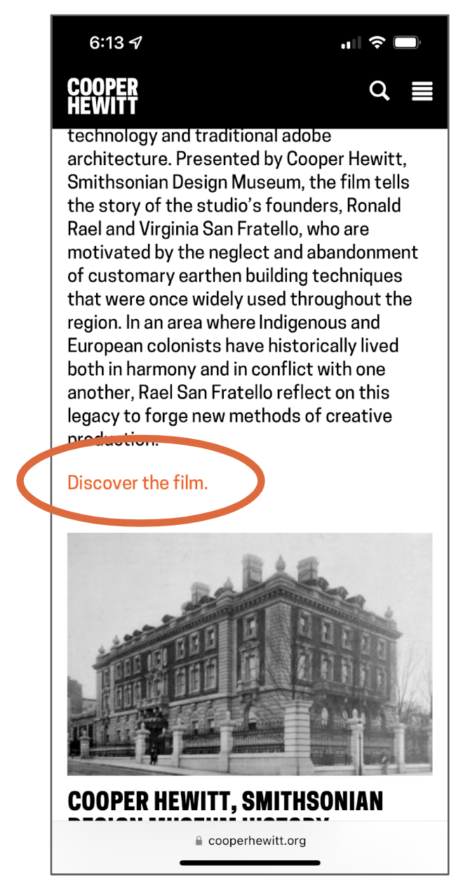
“I wouldn’t intuitively click on it, I would just think it was a piece of text and scroll through it.”
“I know it's a different color but I feel like I could just skip over it."
1.3. Too many hyperlinks in body text was distracting users
We also noticed that on some pages, too many orange hyperlinks within body text distracted users from other relevant information. For one of our tasks, we asked the participant to find out where the Mud Frontier documentary film was screening. The heatmap shows that participants’ visual attention was especially drawn to where those hyperlinks are, but that it significantly distracted them from finding information relevant to the task at hand.
“I wish they highlighted the location better. The first thing I'm reading is [what's highlighted in orange] but I don't know where any of these festivals are.”
“I'm distracted by those orange texts.”

Recommendation 1 – Differentiate What's Clickable
- Use a card design for content that links out to more pages
- Incorporate noticeable buttons to better signify users to discover more
Is this experience mobile-friendly?
We discovered that users on mobile are already at a disadvantage when trying to discover what’s clickable (due to the lack of arrow signifiers), but what else about the Cooper Hewitt website experience may differ on mobile? Our second finding identifies that mobile isn’t properly being optimized in a number of ways.
Finding 2: Mobile isn't being optimized
We noticed that the tasks our participants took a long time to complete usually involved pages with a long scroll. In fact, some of the pages involved a seemingly endless scroll.
2.1. Mobile users were getting stuck in an ‘infinite’ scroll
Some pages had so much content on one page that users thought they must have missed what they came to the page to look for. Watch as one participant tries to purchase tickets to an exhibition, only to have to sift through an endless scroll of information.
"I think at one point I almost doubted myself… I had gone down the page halfway and gone back up because I thought I missed it."
2.2. Important CTAs are at the bottom of pages on mobile
On desktop, these important CTAs are located on the top right of the page – but on mobile, these important elements get pushed down to the very bottom of the page making them difficult to find quickly (especially when users are trapped in an endless scroll). Watch as one participant skips over most of the page content to try to find the link to register for a workshop.
"I hoped the [workshop registration] link would be at the top of the page, and then if I'm interested in reading more I can."
Recommendation 2 – Optimize for Mobile Responsiveness
- Move CTAs to the top of the page on mobile
- Create a shorter page break on mobile to avoid infinite scrolling

Can users make sense of information?
Lastly, we wanted to understand if/how users make sense of the information being presented to them. This question particularly focused on the Design Topics area of the site, where Cooper Hewitt was still testing out which content would be considered a ‘Design Topic’. To address this question, we asked users what they thought about the ‘Design Topics’ page and what they think ‘Design Topics’ are.
Finding 3: Users were confused by what 'Design Topics' were
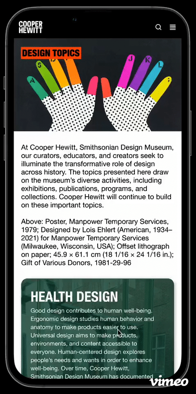
Overall, participants thought that ‘Design Topics’ should encompass more general topics about design concepts and ideas. Yet, some of the content that Cooper Hewitt included as a Design Topic didn’t fit the model that users had in their mind. Narrow topics like the ‘The Mud Frontier Project’ and ‘History of the Cooper Hewitt Museum’ didn’t seem to align with broader design topics like ‘Design Access’.
Recommendation 3 – Design Topics Should Encompass More General Topics
- While design topics like ‘Health Design’ and ‘Design Access’ make sense to users, consider grouping more specific subjects like ‘Mud Frontier’ into broader topics
CONCLUSION
Turning insights into execution.
As a final deliverable, we delivered a presentation to the client with our key findings and recommendations. This presentation also included video highlights from, as well as a more in-depth problem list of all of the findings we encountered throughout the study.
While debriefing with the client on our findings related to mobile optimization, they expressed a newfound realization and enthusiasm for considering mobile users alongside their desktop users moving forward.
“I think the point that you made about using mobile for [quick] tasks as opposed to a deeper dive…we really need to be thinking about that in our mobile design.”
– Pamela Horn (Lead Content Strategist and Director of Cross-Platform Content at Cooper Hewitt)
Additionally, our findings on making content seem more clickable and inviting really resonated with them.
“I think one of my biggest takeaways has been that we put so much of our content out there, but we may need to give people an easier entry into it.”
– Matthew Kennedy (Publishing Associate at Cooper Hewitt)
After presenting our research findings, our client immediately acted on our first recommendation to “differentiate what’s clickable”. [Pictured right], they added consistent use of hyperlinks under each content block to indicate that users can click to discover more about a design topic. We hope that in the future, they can update their website style guide to turn these hyperlinks into a more noticeable button format. We are also eager to see how they incorporate our other insights and findings in the future, particularly if they can redesign the site to be more mobile responsive.
